HOW FERRARI DESIGNED THE GOLDEN ERA OF FORMULA ONE
1 September 2026Michael Schumacher's reign at the top coupled with a visual identity for the ages meant that one team defined the golden era of Formula One. Now, Puma x Ferrari is taking a trip through the archives.
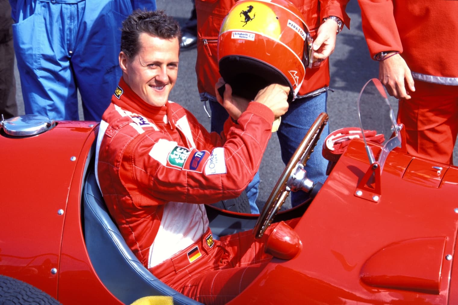
We don’t need to be asked twice. If there’s an opportunity to go digging through archive imagery, we’ll be there. When we caught wind of the new PUMA x Ferrari collection, which lifts its references from the pits, tracks, and stands of '90s and early '00s Formula One, it didn’t take long before we were on a journey back through the Ferrari archive.
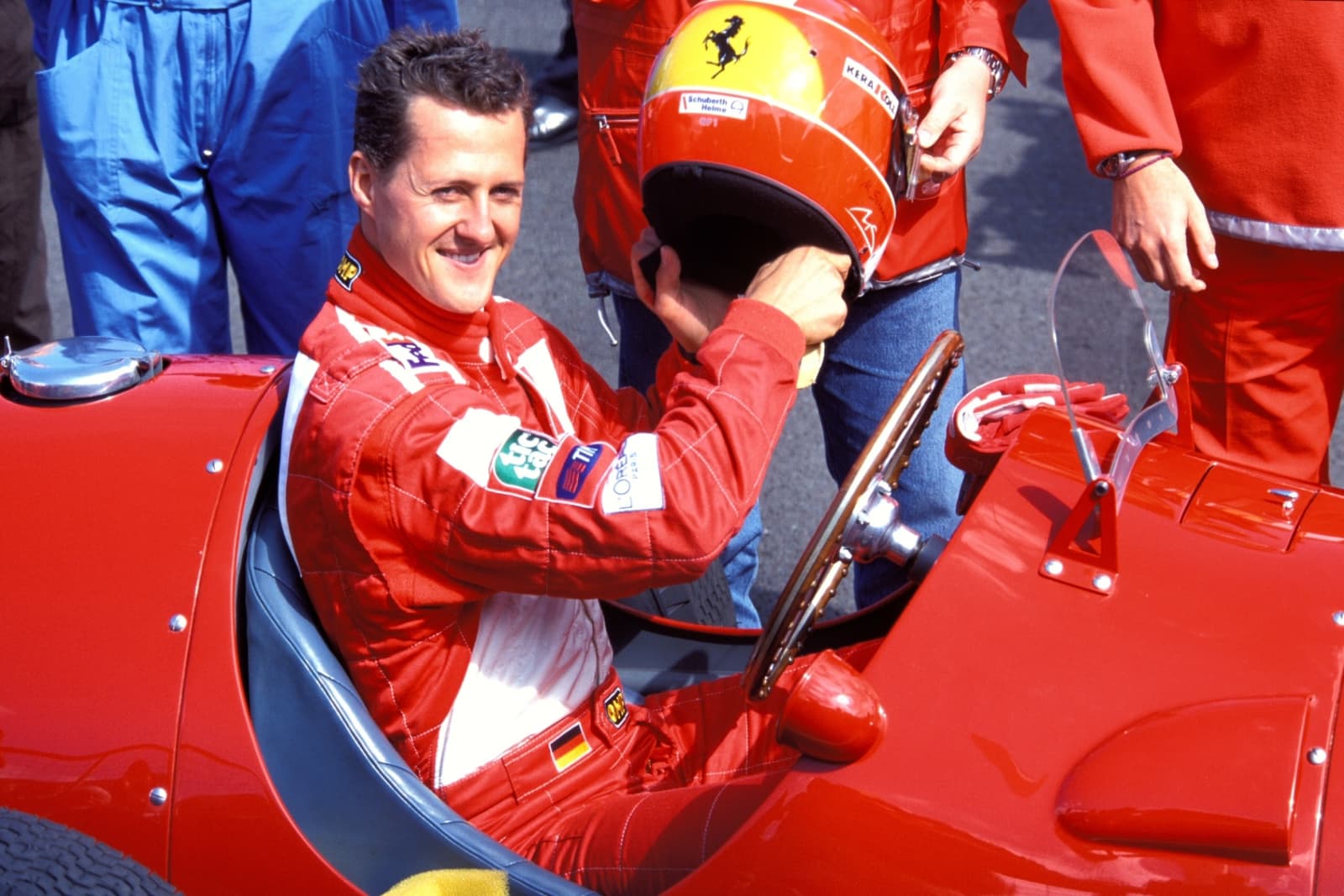
The top line in any Formula One conversation is that the ‘90s and ‘00s belong to Schumacher, and that’s the truth. But that’s not the whole truth. While podium finishes are the name of the game, we reckon looking good while you do it is important too, and at the time, Ferrari had locked down an aesthetic that would go down in history. That part gets talked about less than it should. The golden era of Formula One design can teach sports teams a lot about what it takes to make an intergenerational icon.
Everyone remembers the winning. Five consecutive championships, 72 victories in red, a team that hadn't taken a drivers' title since 1979 turned into the most efficient operation in the sport. What tends to get skipped is that all of it happened while Ferrari was running one of the strongest visual identities any sports team has ever put together, and the two things are not unrelated. Domination on the track gives you a record. Domination attached to a design language people can picture with their eyes shut gives you something far rarer, which is a team that gets handed down. Kids who weren't even born when Schumacher retired can draw that car.
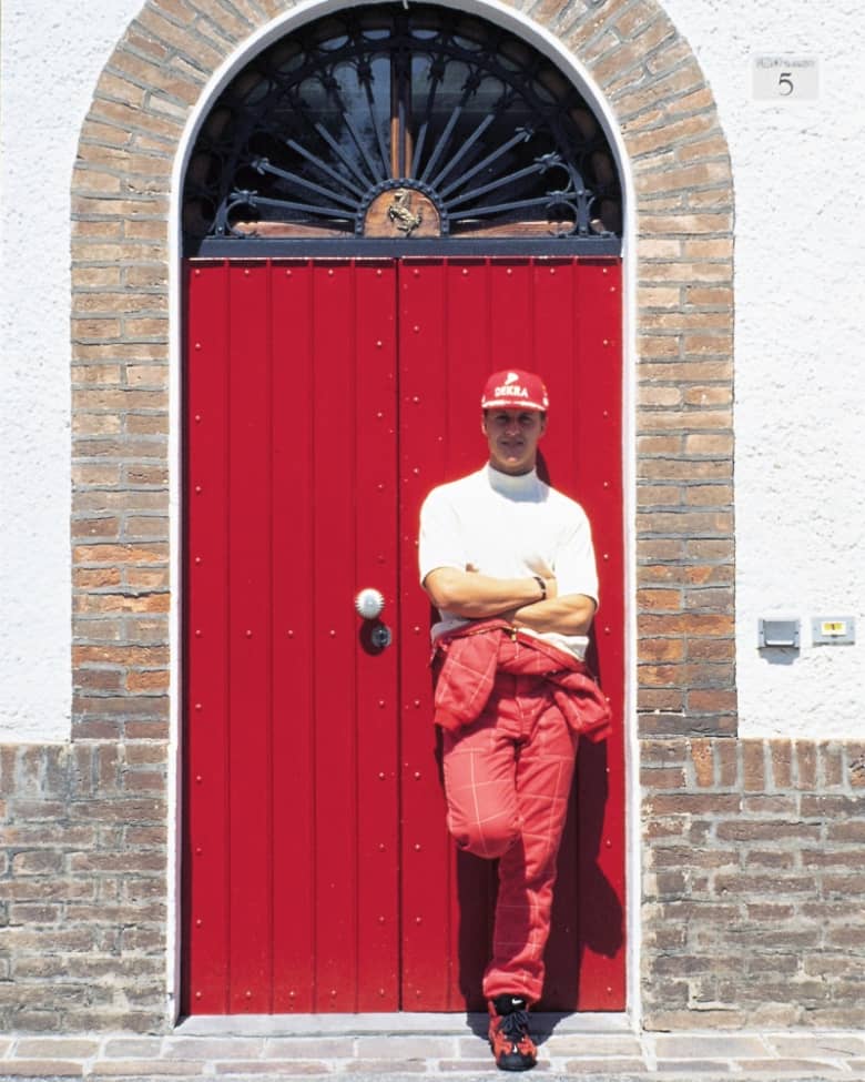
If you’re going to start anywhere, it’s got to be with the colour. Rosso Corsa wasn't a brand decision at all, it was a national racing colour, assigned to Italy in the years when countries had colours instead of sponsors, the same system that gave Britain its green and France its blue. Ferrari just held onto theirs long enough that it stopped belonging to the country and started belonging to them. What's interesting is that they never landed on a specific shade: the hue changed across the decade, warmer in the mid-'90s and deeper by the early 2000s, and nobody seemed to mind, because the idea of Ferrari red was always bigger than any single mix of it. “Ask a child to draw a car and certainly he will draw it red,” famously noted Enzo Ferrari, and nobody has put it better since.
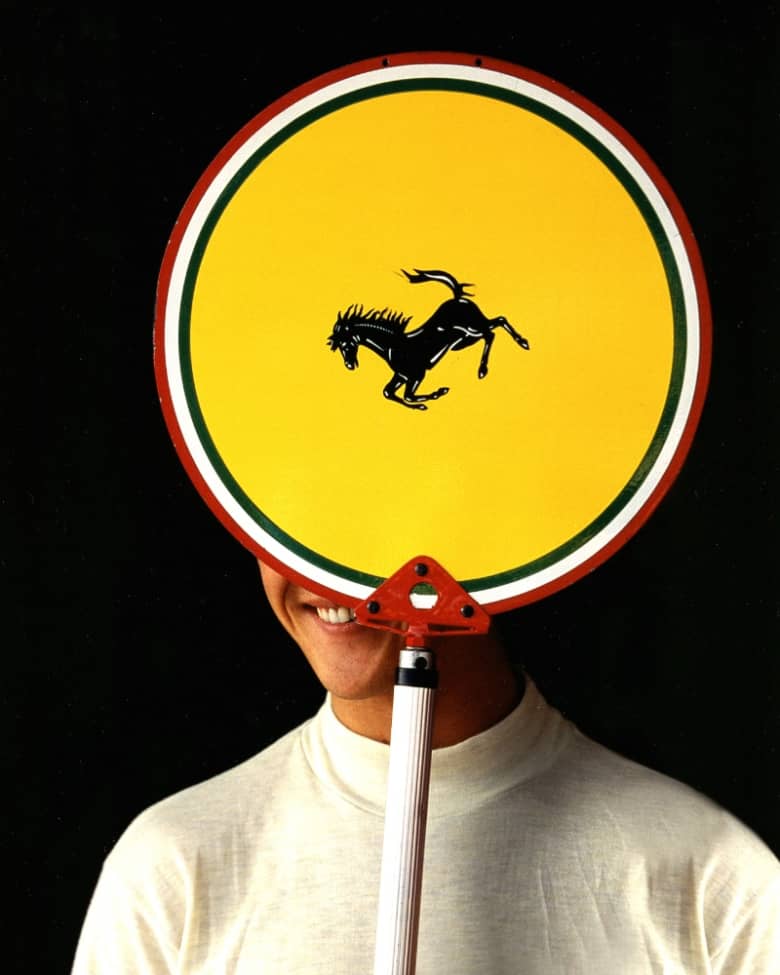
Then the brand marks themselves. The Cavallino Rampante logo came from a WWI fighter pilot, Francesco Baracca, whose mother suggested Enzo put it on his cars. The yellow behind it is the colour of Modena, Enzo's home city. Ferrari kept the shield for the race team and the rectangle for road cars, so the shape on the flank of the F1 car has always carried a slightly different meaning to the one on a Testarossa. Set that against the italic script wordmark and you have an identity built from three or four elements that have barely changed in eighty years, which by any branding metrics is a wild success.
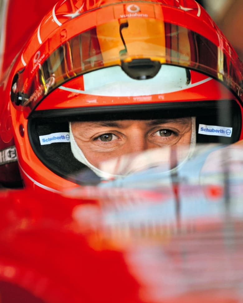
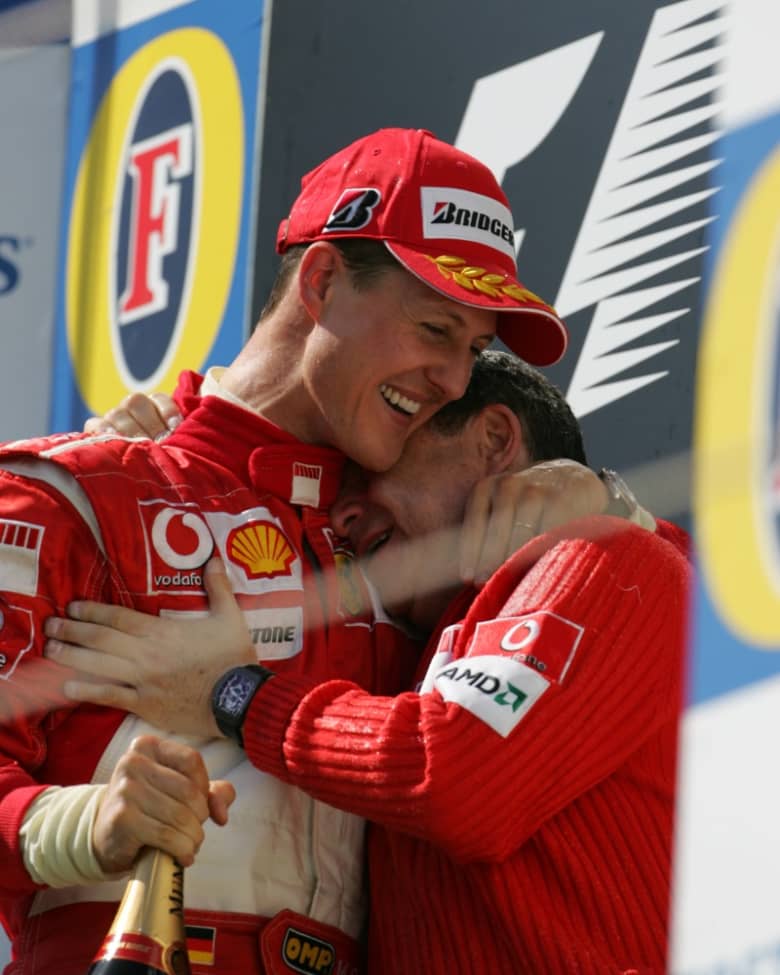
The composition around them is where the era really separates itself. On the car and uniform sat a dizzying amount of sponsors, each one jammed into whatever space was left over. There were no clearance rules, no minimum exclusion zones, no brand guidelines insisting on breathing room, and the panels were painted rather than wrapped, which meant that a human with a spray gun made the final call. Maybe it shouldn’t have worked. That’s why brand guidelines exist, to remove the space for human error. But it’s exactly that human error that made this era so memorable.
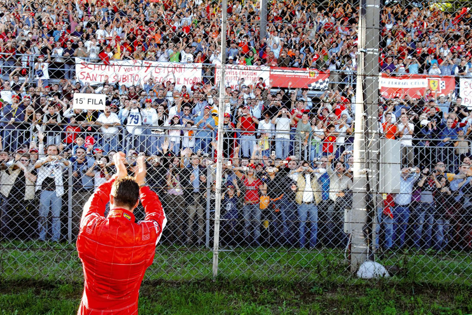
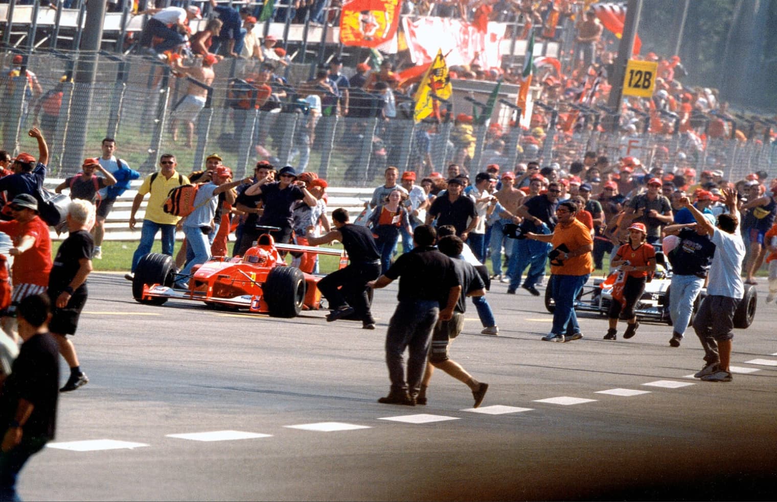
The aesthetic continued away from the car, too. Mechanics in red, engineers in white, the shield across the pit wall. The identity extended into the garage and the paddock with the same discipline, so a photograph of a Ferrari pit stop from 2002 is as recognisable as the car itself. At Monza, with the tifosi filling a royal park, the whole thing reached a scale no other team could get near. PUMA arrived on that pit wall towards the end of the Schumacher run, which is part of why this collection has something to actually go back to.
The teams around Ferrari prove that this was the golden era grid-wide. Jordan yellow, McLaren silver, the Rothmans Williams. It's worth saying that Ferrari's identity was strengthened by having genuine competition for the eye. But Ferrari was the only team with the results to make theirs permanent.
Which brings us to why it still sets the standard. Formula One today is governed visually in a way it simply wasn't then. Watertight regulations mean that the cars arrive at near-identical solutions, teammates run substantially matching liveries, and half the grid is showing bare carbon because paint costs weight that nobody wants to give away. Liveries are vinyl, applied to spec, signed off through approval chains. It's cleaner and it's more consistent, but we can’t help feeling that something has been lost along the way.
Schumacher’s era at Ferrari was the last one where the look of the sport was made by people making decisions, and you can feel it in every image from the archive. Ferrari happened to be the team doing it best, at exactly the moment they were also winning everything, and the combination is why the aesthetic can still be the solid foundation of a collection in 2026.
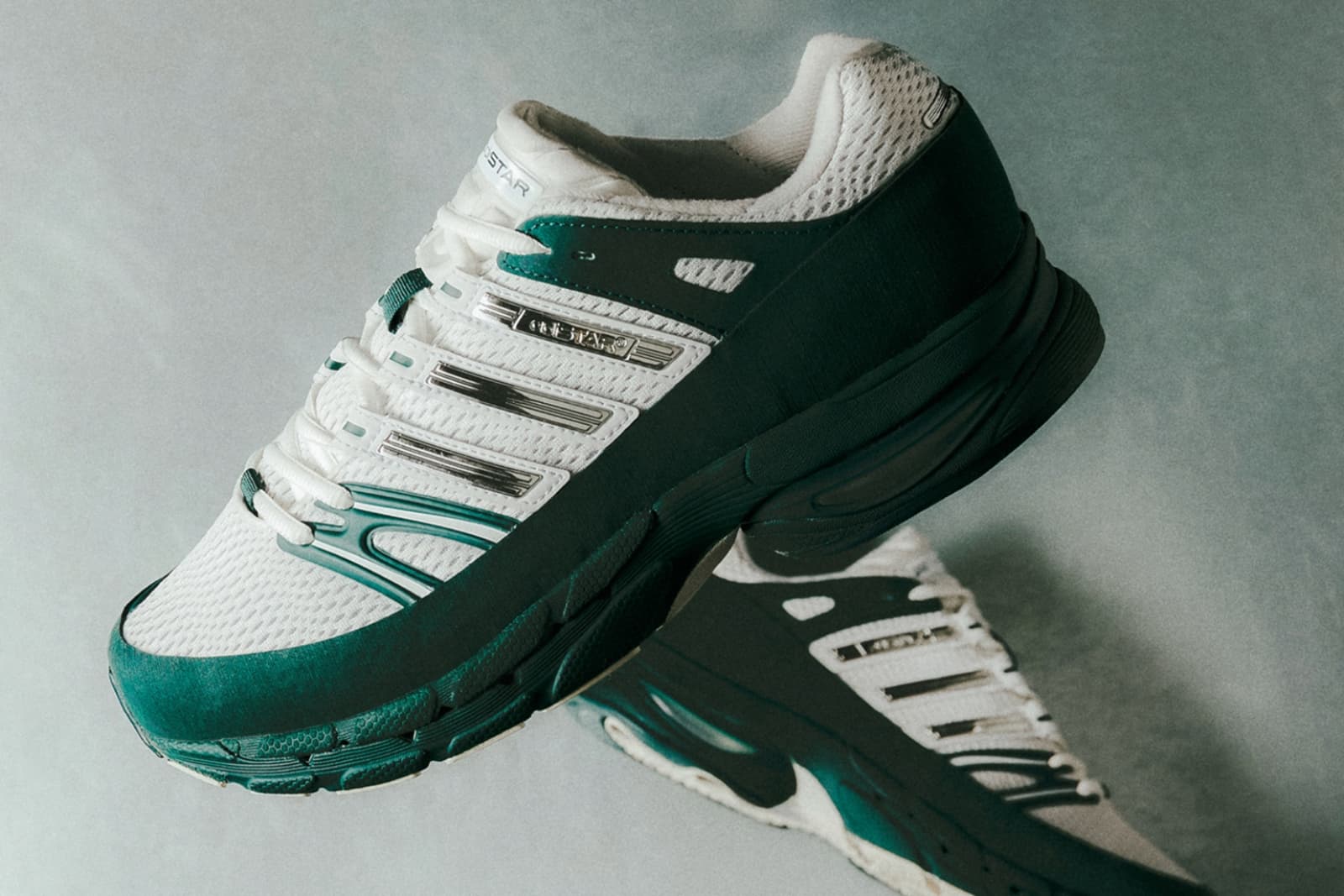
The PUMA x Ferrari collection translates the era with skill. Laurel, seven stars, red contrast stitching, cut like team kit rather than merchandise. It isn't nostalgia so much as an acknowledgement that the golden era will always be the blueprint.
Style as a whole has started looking back more than ever before. While some categories look to cutting-edge functional design, the everyday wardrobe largely turns to vintage cuts, aged washes, and imperfection as a sign of quality. Ferrari’s golden era of Formula One design embodies it all.